
Project Overview
Project Title: Redesigning DriveSales for Usability and Modernization
Role: Lead Product Designer
Team: Developers, Project Managers, Product Owner, UX Designers
Tools Used: Figma, Miro, Illustrator
Timeframe: 6 Months
______________________________________________________________________________________________________________________________________________________
Key Issues
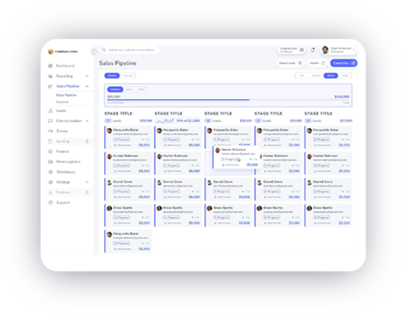
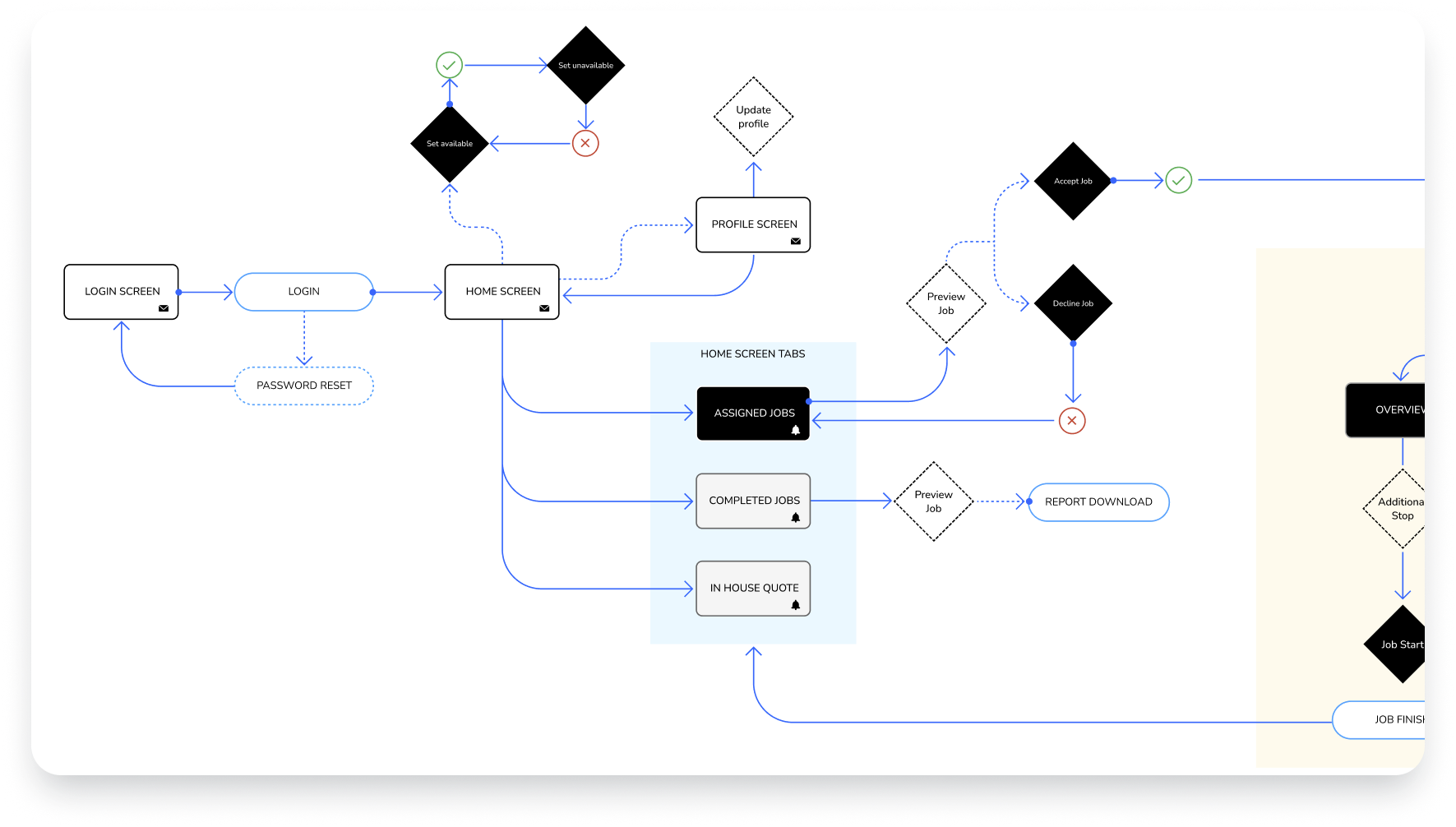
Overwhelming Move Screen:
The most used page was cluttered with too much information and unclear next steps for users.
Lack of Uniformity:
Over the years, multiple designers worked on the app, leading to inconsistent design elements and interactions.
Lack of Responsiveness:
The app’s responsive design didn’t meet modern standards, creating usability issues on mobile and tablet devices.
______________________________________________________________________________________________________________________________________________________
Design Process
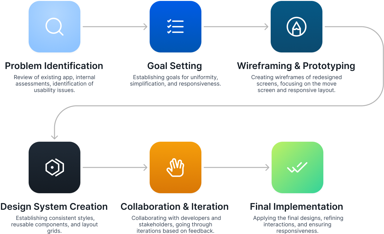
Prototyping Phase
During the prototyping phase, the primary goal was to translate the wireframes into interactive models that could be tested and iterated on quickly. Given the overwhelming complexity of the move screen and other usability issues, it was essential to create clickable prototypes to visualize the redesigned user flows and gather feedback from internal stakeholders. The prototypes allowed us to experiment with different layouts, simplify interactions, and ensure that the app's responsiveness worked seamlessly across devices. This phase was critical for validating design decisions before moving to the final implementation, saving time and avoiding costly revisions later in the process.
The Design System
The design system was a crucial part of the DriveSales app redesign to address the lack of uniformity caused by multiple designers working on the project over the years. Without a cohesive design framework, the app suffered from inconsistent styles, layouts, and interactions, which led to a confusing user experience. To resolve this, we created a comprehensive design system that established consistent visual elements like typography, color schemes, buttons, and grid layouts. This system not only unified the user interface but also ensured future scalability by providing reusable components, streamlining collaboration with developers, and maintaining design integrity across the app.

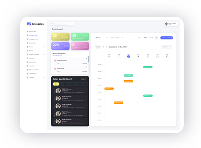
The Final Iteration Phase
The final iteration phase marked the culmination of the redesign efforts, where we refined every detail of the app’s user interface. After multiple rounds of feedback and testing, the redesigned move screen was streamlined, significantly reducing information overload while making the next steps clear for users. The responsiveness was optimized across devices, and the design system was fully integrated, bringing uniformity to every element. This final iteration ensured the app met modern usability standards, offering a vastly improved experience compared to the old version. Below, you can see a direct comparison between the old and new designs, highlighting the major improvements in clarity, consistency, and responsiveness,

Old Design

New Design
Final Statement:
The DriveSales app redesign successfully transformed a fragmented, overwhelming user experience into a cohesive and user-friendly product that meets modern standards. By addressing the lack of uniformity, simplifying complex interfaces like the move screen, and ensuring full responsiveness, the new design not only enhances usability but also aligns with the needs of today’s users. This project highlights the importance of a thoughtful, iterative design process and close collaboration between designers, developers, and stakeholders to create a product that is both functional and visually consistent. The results speak for themselves, as shown in the side-by-side comparison, demonstrating the value of design thinking in driving product success.